Bound Images
The Workshop Scheme of Hand-Coloring in the 1513 Edition of Ptolemy’s Geography
by Chet Van Duzer
One of the most important optional features in the production or post-production of printed maps in books was hand-coloring. Hand-coloring made printed maps look more like exclusive and expensive manuscript maps; the coloring also made it easier for the eye to distinguish land from ocean, and various geographical units from others. While hand-coloring added from 25 to 100% to the cost of a map (1), the result was still much less expensive than a manuscript map.
In this brief note I summarize research on the hand-colored maps in the 1513 edition of Ptolemy’s Geography, the most important edition of the sixteenth century, whose maps were made by Martin Waldseemüller, and which was printed in Strasbourg by Johann Schott (2). The goal of the research was to identify the workshop coloring scheme, that is, the coloring scheme intended by the creators of the edition.
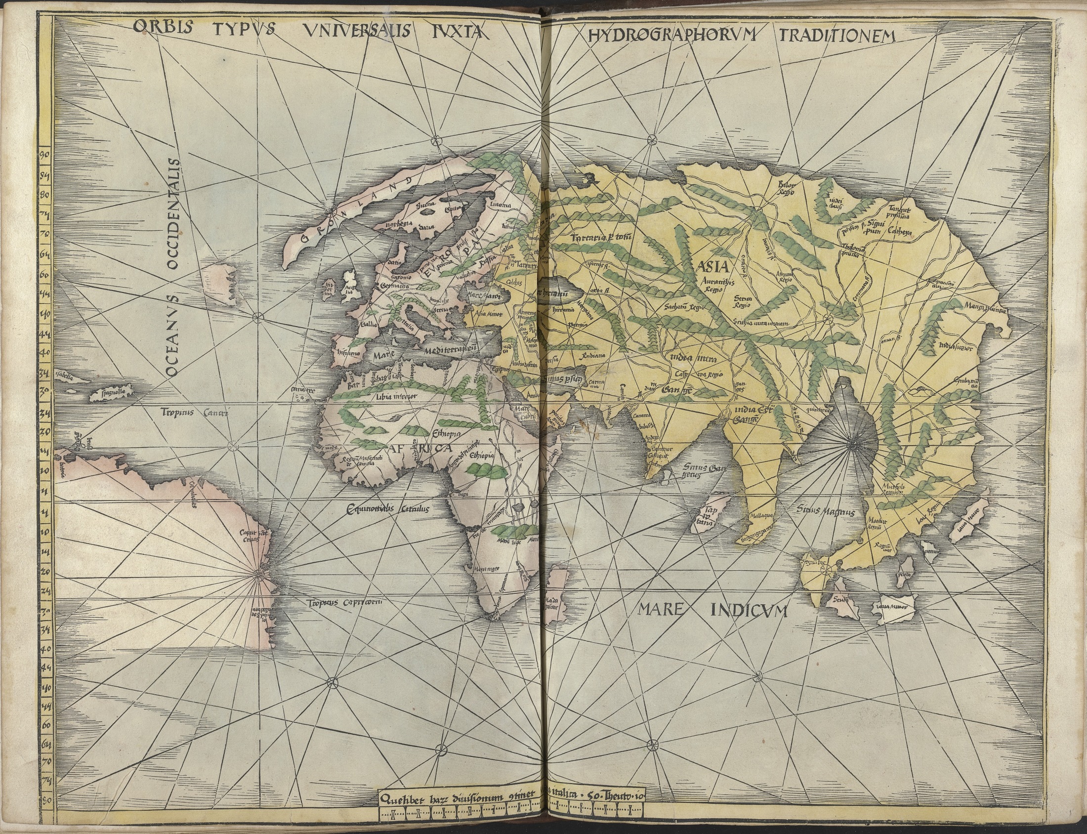
Examining just a few hand-colored copies of the 1513 Ptolemy reveals considerable variation in the coloring, and thus is not very encouraging in terms of finding a consistent workshop scheme, but I undertook a global census of the hand-colored copies of the book, seeing some of the exemplars in person, while for the rest I ordered digital images of a selection of the maps. The results of the census are presented in the Appendix. Of the thirty-five surviving hand-colored copies of the book that I located, 16, or just under half, show a consistent coloring scheme. This scheme involves a light blue-gray wash for the seas; green for the mountains; yellow for the borders of the maps; and yellow, light red, a yellowish green, and a light gray wash for the lands. A dark blue was used for the clouds that surround the Ptolemaic world map, and for some of the islands in the Red Sea on the sixth map of Asia and the modern map of northern Africa. The high percentage of copies of the book that have this same coloring scheme makes the conclusion that this was the workshop coloring scheme inescapable. This conclusion is corroborated by the fact that Waldseemüller used similar colors in his experiments with color printing of the maps in the 1513 Ptolemy (3).
Figure 1 illustrates the “modern” world map from the exemplar of the 1513 edition in the Yale Center for British Art, which is colored in the workshop coloring scheme. Further studies of the hand-coloring of maps in atlases have the potential to reveal much about the perception, consumption, valuing, and aesthetics of maps in books.
__________
(1) On the cost of hand-coloring see Woodward, “Techniques of Map Engraving” (see note 1), p. 603, who says that coloring added 50% to the cost of a map. Ehrensvärd, “Color in Cartography” (see note 1), p. 139, says that coloring “very seldom contributed more than a quarter of the cost of an uncolored map.” Dirk Imhof, “The Production of Ortelius Atlases by Christopher Plantin,” in Marcel van den Broecke, Peter van der Krogt, and Peter Meurer, eds., Abraham Ortelius and the First Atlas: Essays Commemorating the Quadricentennial of his Death, 1598-1998 (Houten: HES, 1998), pp. 79-92, p. 82, cites evidence that coloring could double the cost of an atlas; while Truusje Goedings, ‘Afsetters en meester-afsetters’: De kunst van het kleuren 1480–1720 (Nijmegen: Vantilt, 2015), p. 71, cites evidence that it could quadruple the cost.
(2) See my article “Colored as its Creators Intended: Painted Maps in the 1513 Edition of Ptolemy’s Geography,” forthcoming in Imago temporis 2019. On the 1513 edition of Ptolemy R. A. Skelton, “Bibliographical Note,” in Ptolemy, Geographia, Strassburg, 1513 (Amsterdam: Theatrum Orbis Terrarum, 1966), pp. v-xx; and Alfred Hiatt, “Mutation and Supplement: The 1513 Strasbourg Ptolemy,” in Zur Shalev and Charles Burnett, eds., Ptolemy’s ‘Geography’ in the Renaissance (London: Warburg Institute, and Turin: Nino Aragno Editore, 2011), pp. 143-161.
(3) Rodney W. Shirley, “Karte der Britischen Inseln von 1513: eine der ersten farbig gedruckten Karten,” Cartographica Helvetica 19-20 (1999), pp. 13-17; Albert Eiselé, “La carte ‘Lotharingia-Vastum Regnum’ de 1508-1513: Observations et réflexions,” Les Cahiers Lorrains 3-4 (1990), pp. 297-318.